Project Description
NYC Open Records Devpost Hackathon
Building violations, 311 or 911 phone call records, personnel records for city employees including DOE educators and NYPD officers, medical reports, autopsy reports, court proceeding transcripts and more — it turns out that there are numerous city agency records that members of the public have the legal right to access. Yet, while Freedom of Information (FOI) laws provide a legal process for people to access government agency records, this doesn’t mean that the process itself — handled separately by each municipality in accordance with state and federal laws — has been easy or intuitive for either those who seek the records or the city employees that fulfill their requests.
Skills:
Analysis
UI/UX Design
Wireframing
Prototyping
Links:
In New York City, FOIL requesters have typically submitted their written requests directly to city agencies by post or email, embarking on an opaque and frustrating process with no clear end (“What happened to my request? It’s been weeks since I sent it in! I have no idea what the status is. Why was my request rejected?”).
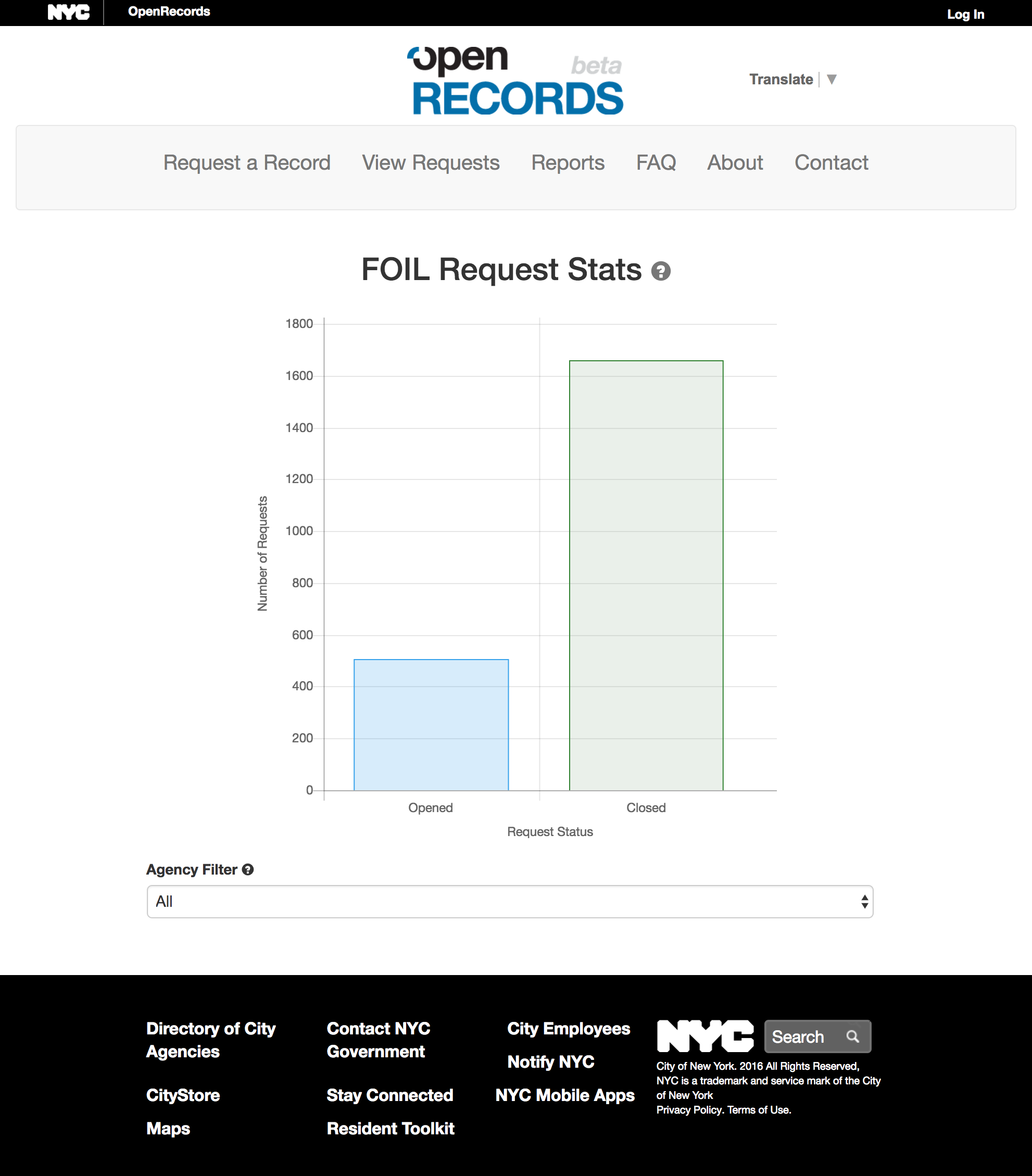
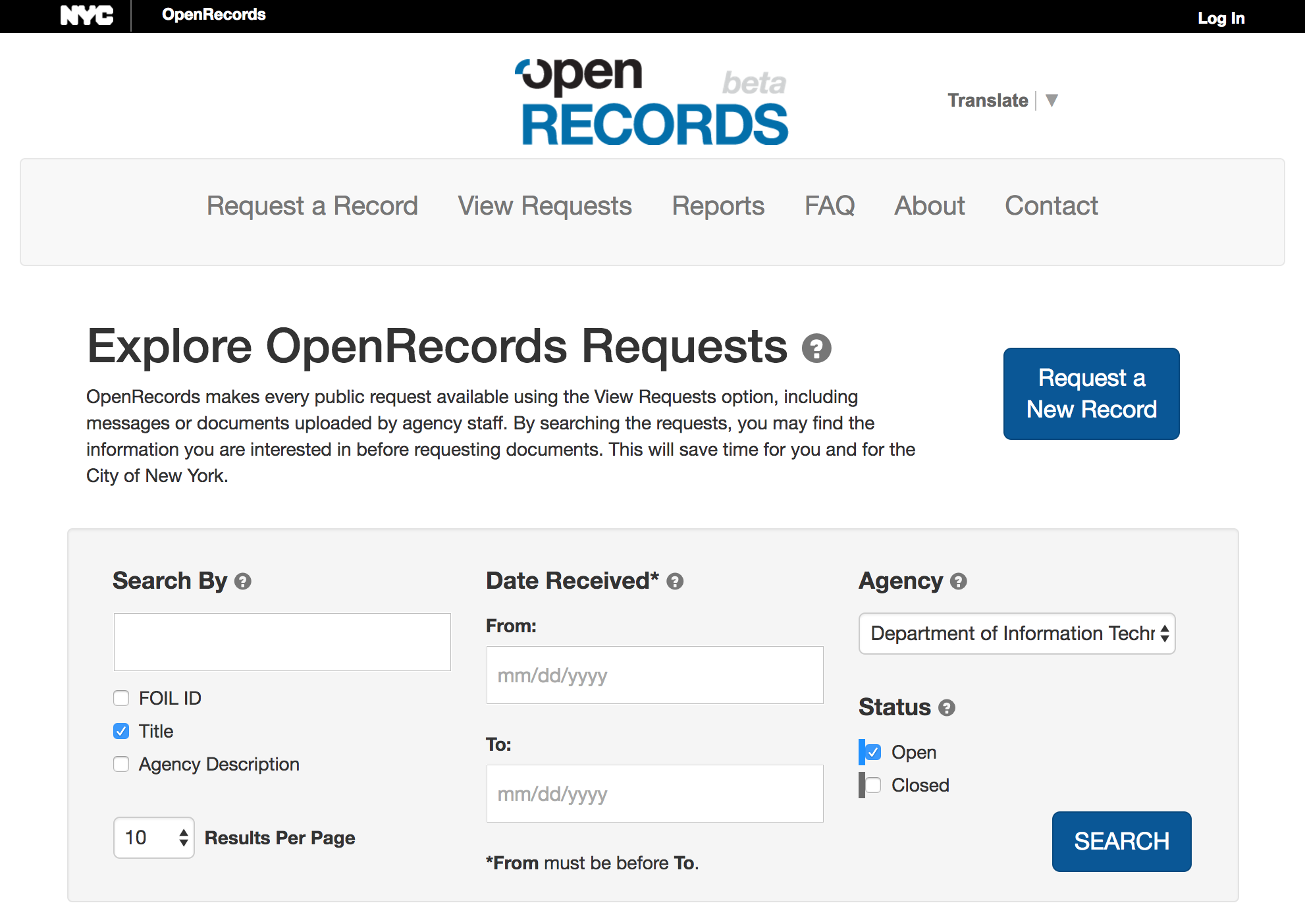
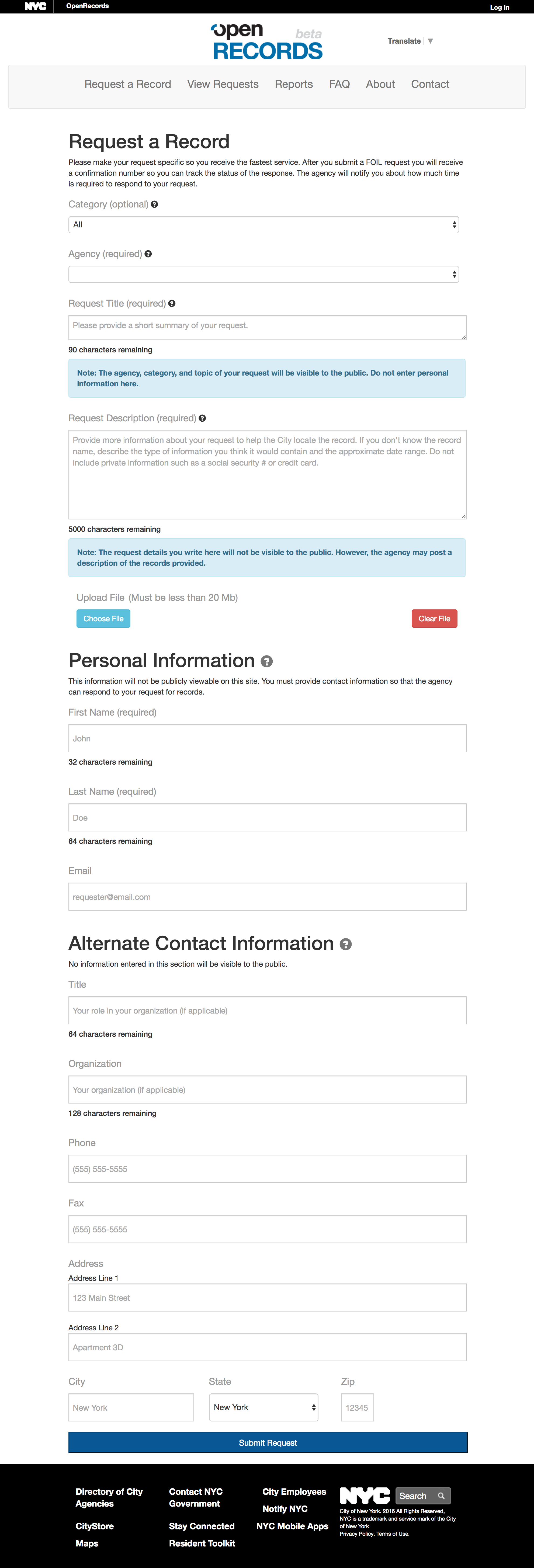
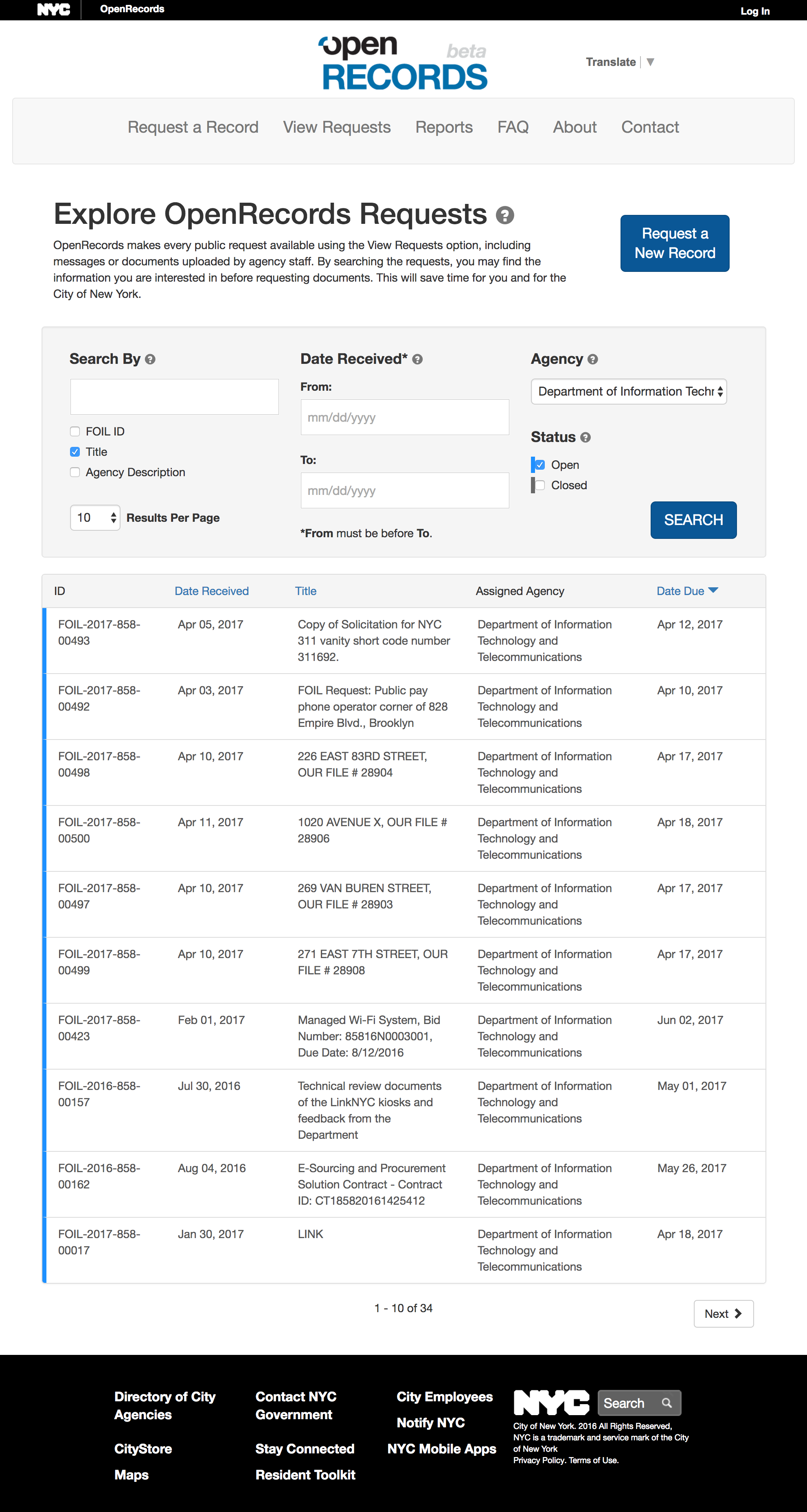
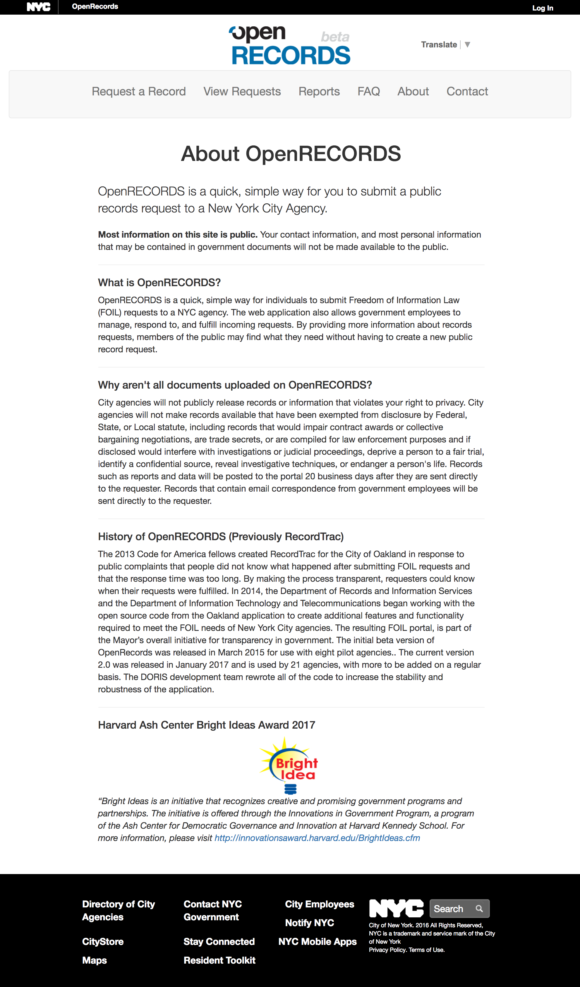
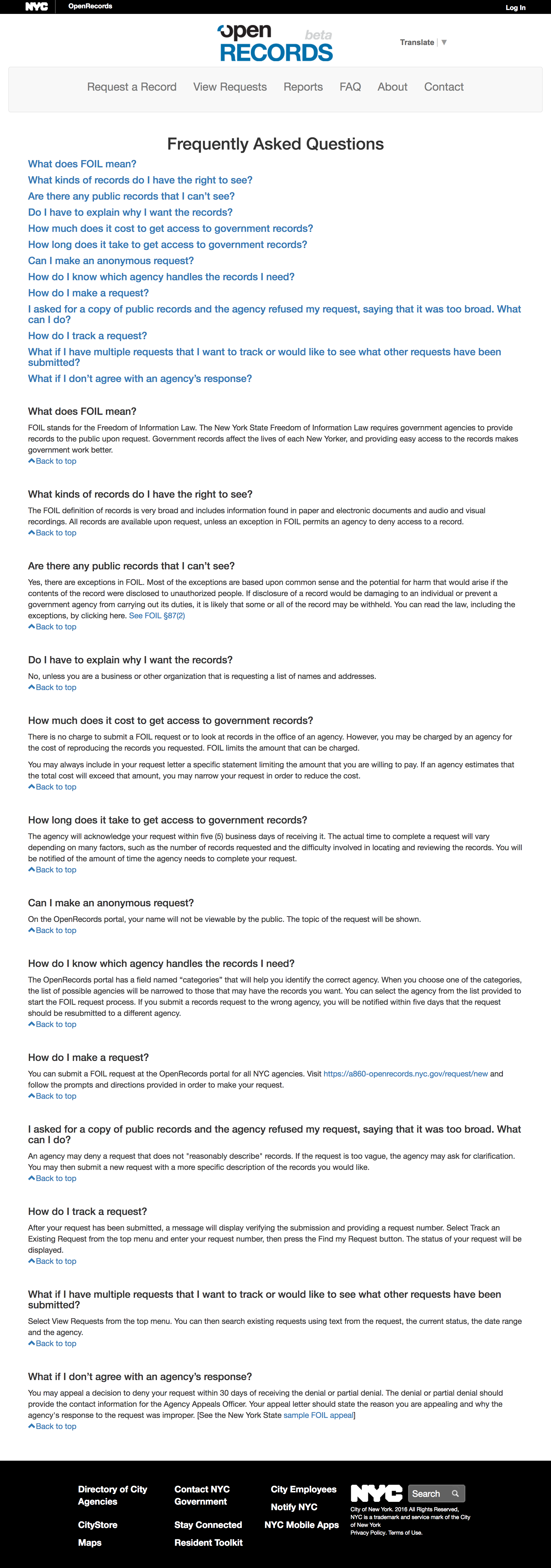
In 2015, the NYC Department of Records and Information Services (DORIS) beta launched OpenRecords (here are some screenshots taken in early 2017), an online portal that provided a centralized location for requests to be made to NYC’s various city agencies.
The Challenge
In 2017, Devpost and the NYC Department of Records ran a week-long virtual hackathon, inviting UX and UI professionals to improve upon the OpenRecords user experience. Specifically, three challenge areas were identified: 1) helping users make Freedom of Information Law (FOIL) requests online, 2) setting users’ expectations about what to use the OpenRecords tool for, and 3) improving upon the Search, View and Track features for existing OpenRecords requests.
The first 3 days of the week-long event were spent researching the issue to understand who the users were. It turns out that, while many FOIL requesters are seasoned pros (investigators, journalists, attorneys), others (I called them “newbies”: community organizers, parents, business owners, for example) are less informed or familiar with the process.
Which city agencies handle which documents? Is the information I’m seeking even IN a document? What is the official name of the document I need? Is there another process by which I can get the information I want? It was clear, from viewing the long list of denied requests in the OpenRecords database, that many “newbie” requesters were making similar mistakes: requests made to the wrong agencies, insufficient information provided, requests for documents that didn’t exist, among others.
Reframing the challenge
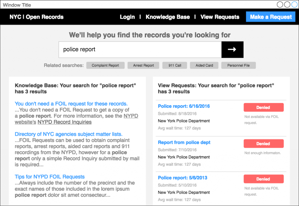
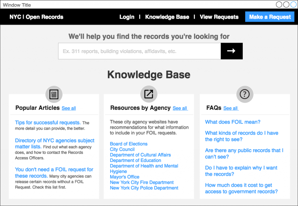
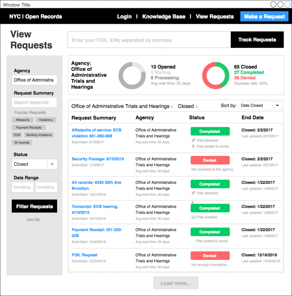
Beyond delivering an aesthetically “simple and intuitive” FOIL request form submission process, I reframed the problem to one of ensuring high-quality requests while minimizing request denials. So, while the hackathon guidelines suggested that designers choose one challenge to concentrate on, I followed my intuition that the three challenges were strongly interrelated, and that by helping both “newbie” and “pro” users view and filter past requests and results, and directing them to clearly organized resources about which city records are held by which city agencies, the ultimate success of all users’ requests could be improved.
When “Easy” Design isn’t “Good”
Should making a FOIL request be “as simple as possible”? Easy, “frictionless” user interfaces are often called for in design briefs, especially for e-commerce solutions, where it is desirable to discourage bounce rates, quickly onboard new users and drive sales. In the case of FOIL requests, however, directing a user off-site is not a bad thing if the user’s need (for ex. “I want a copy of a police report”) cannot actually be met with a FOIL request. Similarly, making it too easy for users to submit poor-quality FOIL requests is sustainable neither for city agencies nor document requesters.
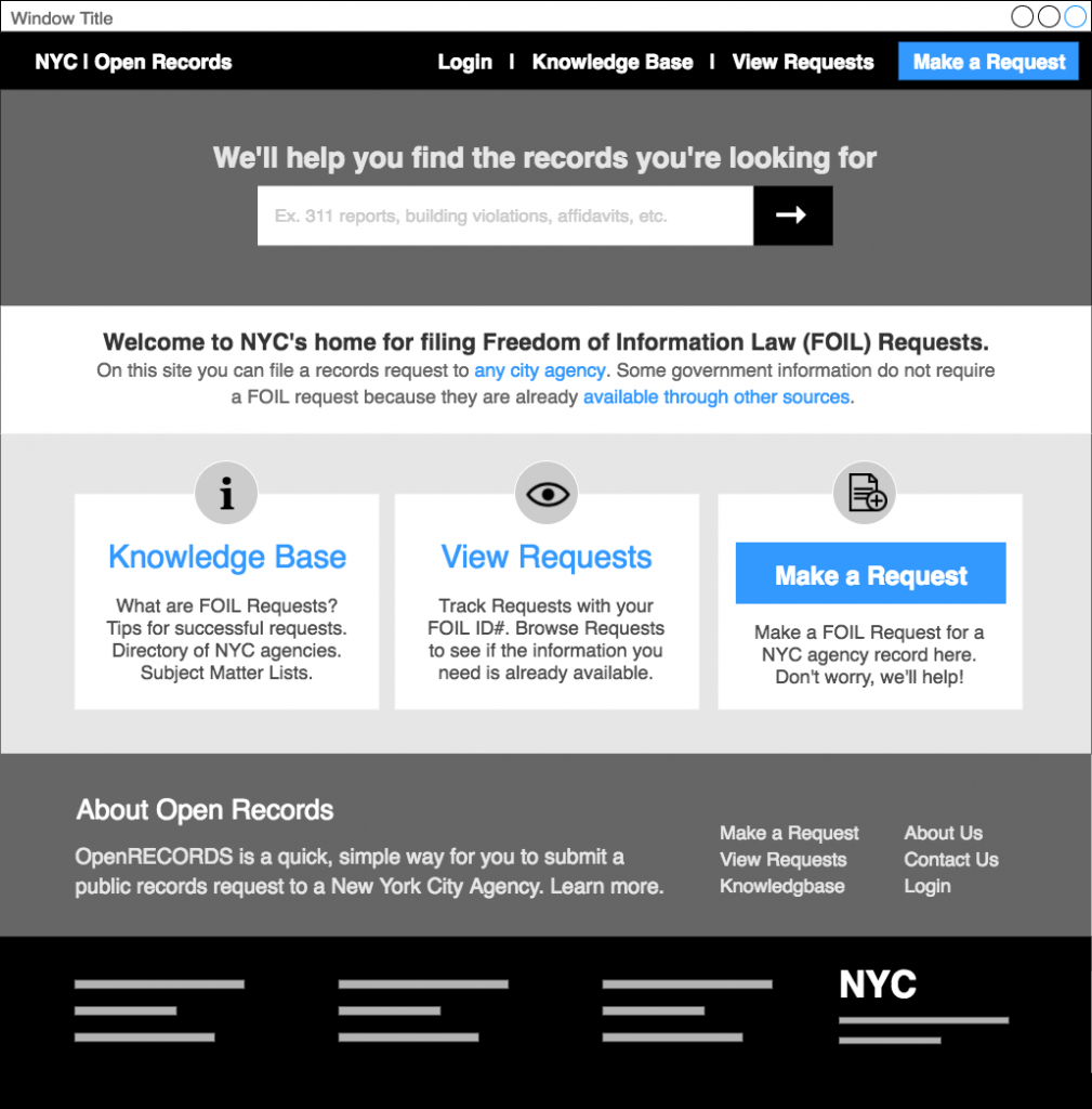
To this end, I modeled the OpenRecords wireframes on the typical layout of customer service and technical support portals. These types of websites, often offered by software companies, prioritize an easily searchable knowledge base and user forums to encourage “pros” helping “newbies,” while discouraging trigger-happy, low-quality support emails (“This sucks! Help!”). After a user develops a more detailed understanding of their particular problem, they can then proceed towards creating a high quality support ticket that is more likely to be effectively addressed by customer support technicians. Since most users typically scan from top left to bottom right, I reflected this prioritization by placing a large predictive search bar at the top center and positioning the “Make a Request” button in the lower right.
A Guided Form
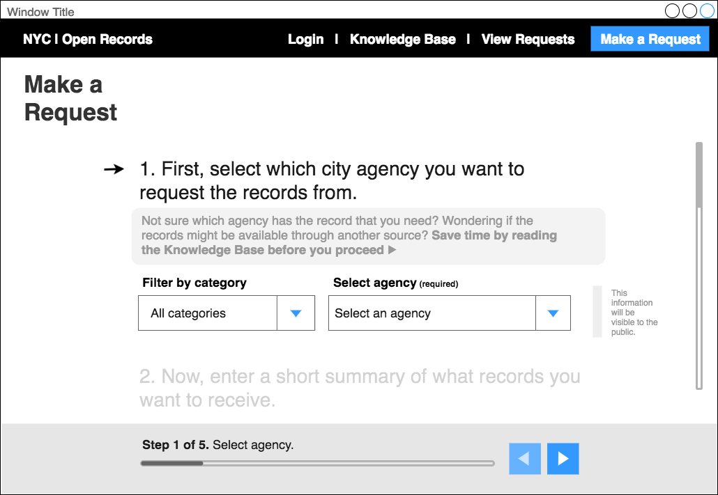
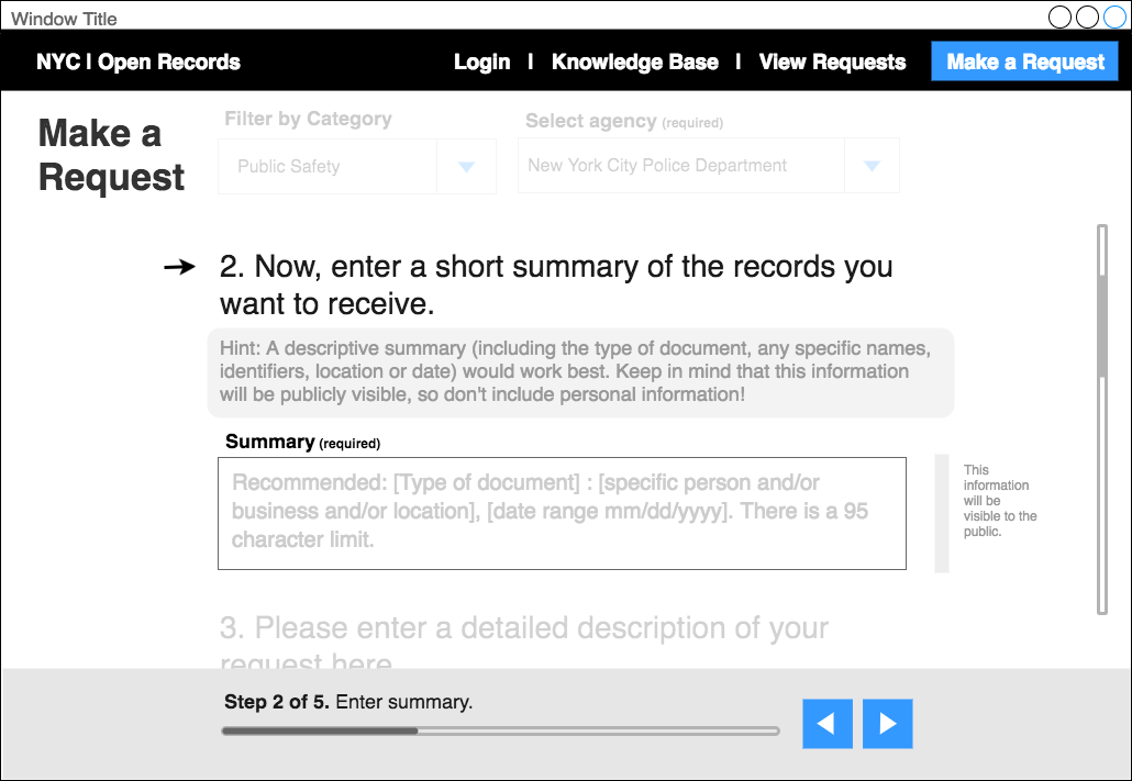
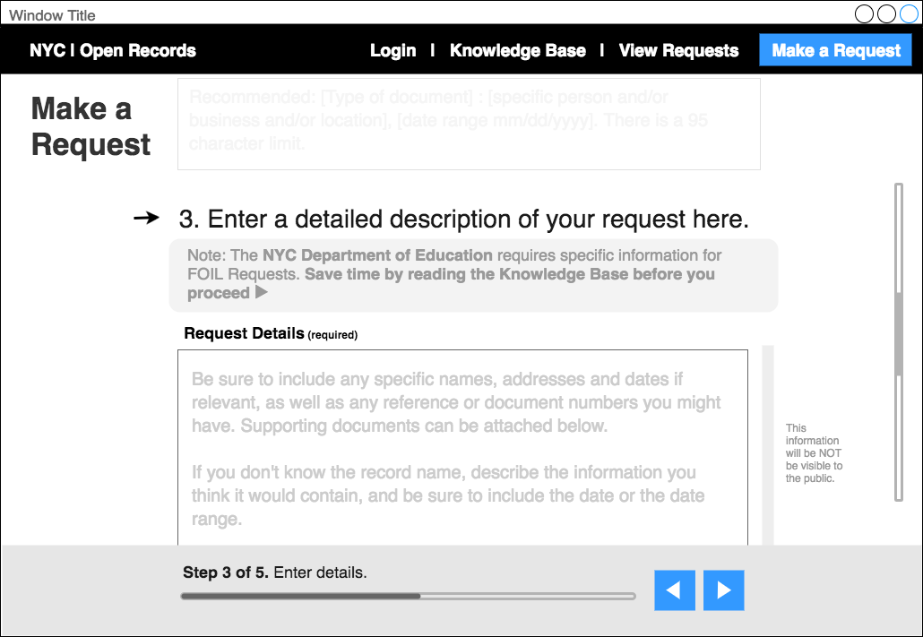
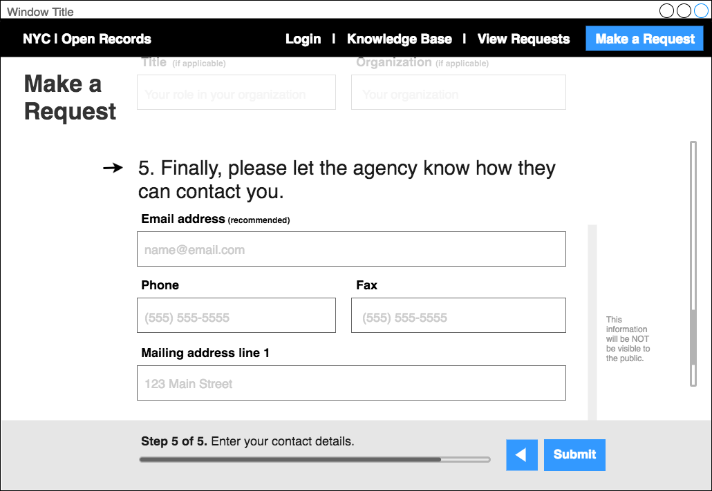
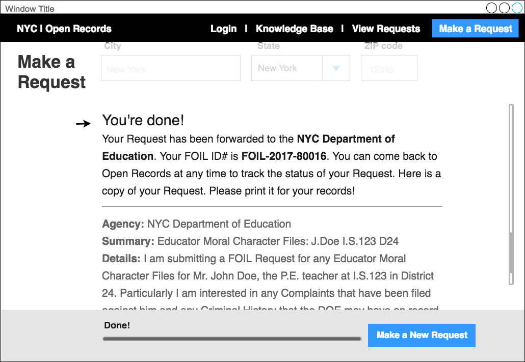
In preparation for designing the “Make a Request” form itself, my research revealed that the types of information required were as varied as the types of records and types of agencies themselves. Any form that attempted to obtain all the necessary information for each document and agency by requiring discrete data fields to validate would not only be incredibly difficult to build and maintain, but would also pose a logistical hurdle to “pro” journalist or attorney users who typically submit their requests as a carefully worded letter (best submitted as a cut and pasted text block or uploaded PDF). Instead, my proposed wireframes used progressive disclosure to let users focus on one step at a time, included more description and guidance on how to fill out certain fields, allowed users to skip ahead and go back in the form, and provided a progress indicator to let users know where they were in the process.
