Project Description
Canary
Canary (workwithcanary.com) helps workplaces build financial hardship funds for their employees, harnessing digital technology to facilitate timely cash grants when workers need it most. I worked with Canary to implement changes to the employee hardship grant guidelines for a major US retailer. With the goal of improving grant outcomes for as many of the company’s eligible employees as possible, we used journey mapping, user stories and user tests to promote an applicant-centered approach. Then, incorporating equitable and accessible design patterns, we re-designed their online application and provided the grant-maker’s engineering team with a final clickable prototype and logic table.

Using user stories
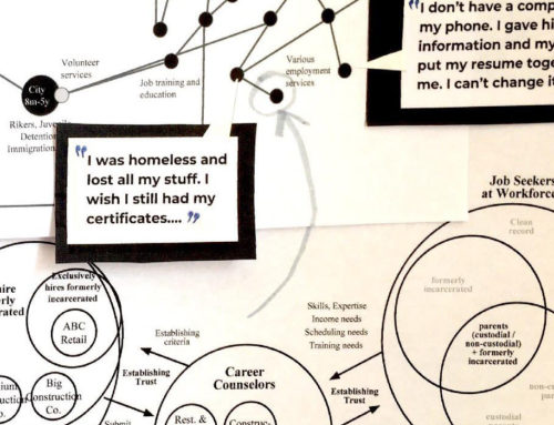
I developed user personas and stories to “stress test” the new application guidelines, gather stakeholder feedback and clarify applicant eligibility requirements. Which life situations were qualifying financial hardship events? Which life situations were not? What was the best way to clearly communicate this to applicants, to increase the quality of applications and the rate of approvals?
User testing
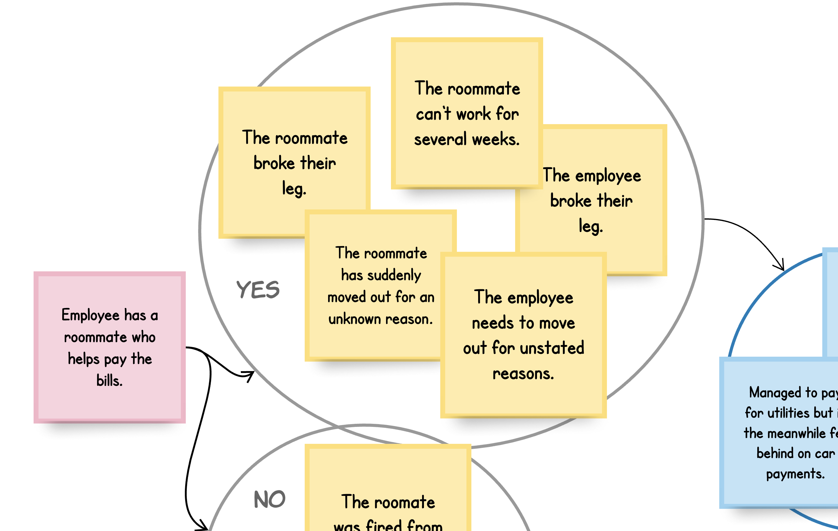
In the search for a fair and just financial need benchmark, I helped the employer develop interview guides and user tests to compare the usability of two different models. Would employees find it easy to answer questions and provide documents about their income and expenses? Which documents and questions provided the most accurate and fair outcomes? Which documents and questions posed insurmountable challenges for otherwise eligible applicants?
Lowering barriers
- An eligibility quiz as an interactive tool to understand the application guidelines
- Document lists so applicants know what proofs they will need to gather before starting the application
- Contextual plain-language pop-up definitions for legal and financial terms
- Staged, conditional questions, limited to 1 or 2 per screen, to minimizing demands on mental bandwidth
- Large, high-contrast text and buttons, with clear distinctions between primary and secondary actions
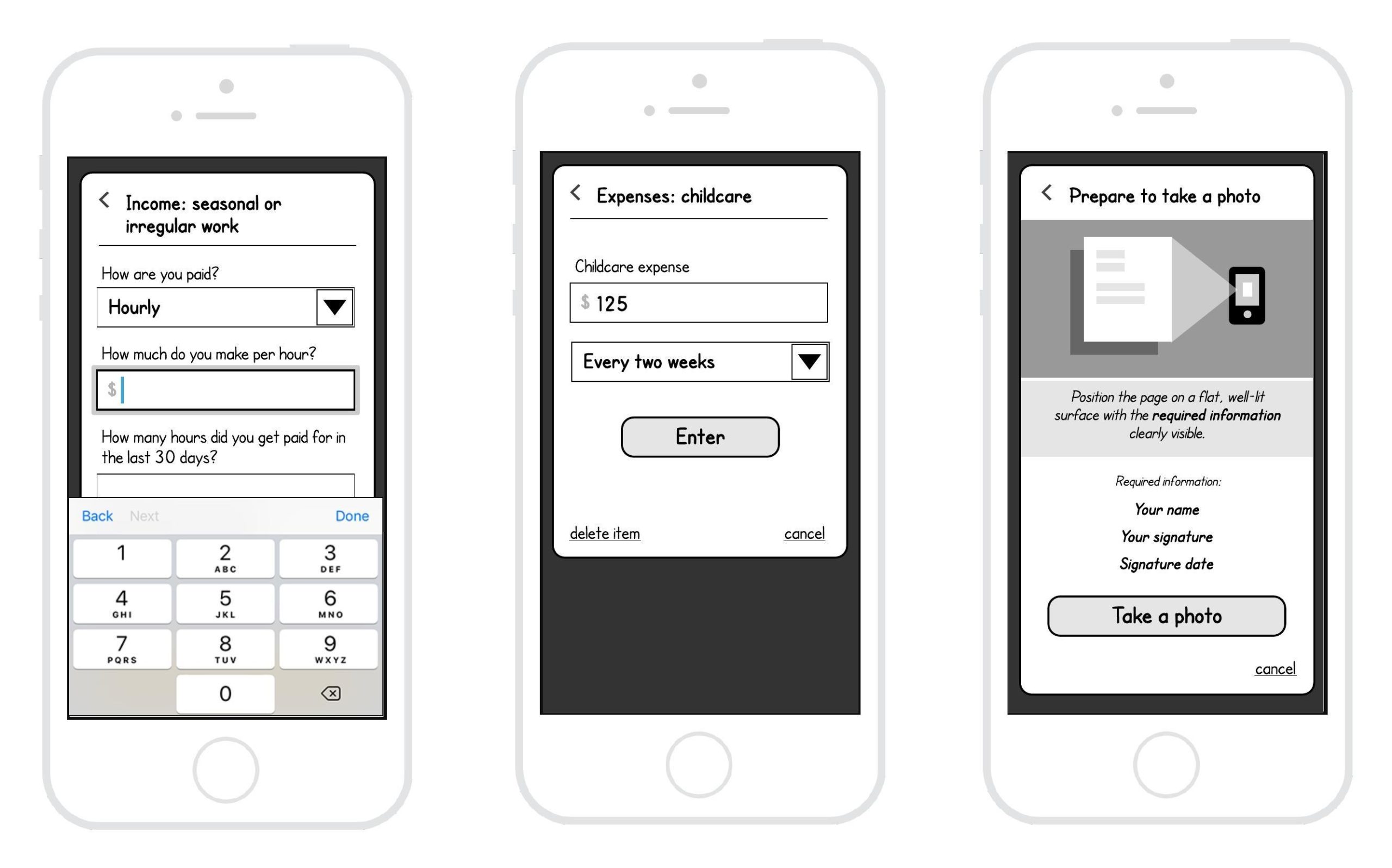
Finally, after designing wireframes and journey-mapped user flows to align a broad range of stakeholders on a new, more applicant-centered eligibility quiz and application, I used Sketch and Figma to deliver a clickable proof-of-concept, and Google Suite to provide an end-to-end requirements table of the revised application logic.