Project Description
Exclaim Branding
Skills:
Analysis
Branding
Concept
Presentation
Marketing
What would you call a mobile payment service for self-employed mental health providers? An iOS app that files claims, keeps track of payments and handles eligibility checks and problem resolutions, all so that psychologists and other mental health practitioners can stop worrying about insurance and focus on treating their patients instead?
I joined Electronic Remedy — a small team of developers and healthcare billing experts — in the early stages of development, and led the naming and branding discussions that shaped the app’s name, logo and brand.
What’s in a Name?
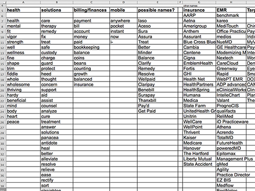
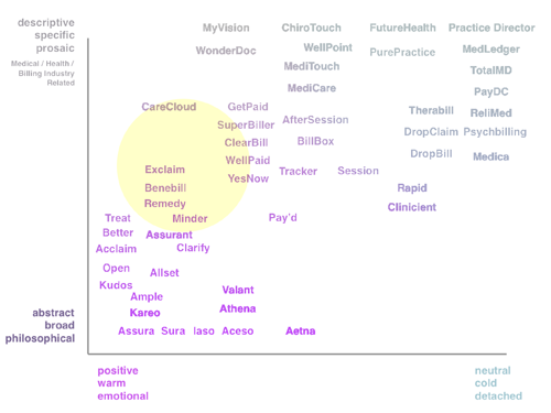
We began the naming process with a competitive analysis that took a long hard look at a broad selection of brands in the healthcare billing and insurance space. After mapping hundreds of competitive brand names to an evaluation matrix, weighing every aspect from length and mouthfeel to emotion and message, we took an honest look at who our users were, and the stressors and hurdles they faced in getting paid for their work. Through this process, we realized that the app’s name needed to resist any sense of tedium or chore, instead conveying a sense of relief and confidence like a breath of fresh air.
With these findings in mind, I sat down with our development team and stakeholders and we all had a bit of fun brainstorming real and imagined words in a game of free association. It took a few meetings, but with the groundwork laid, we immediately knew we had a winner when a team member suggested “Exclaim”! “Exclaim” communicated, with wit and brevity, the perfect mix of confidence and joy that we wanted to bring to the billing landscape.

Expressing Confidence and Joy
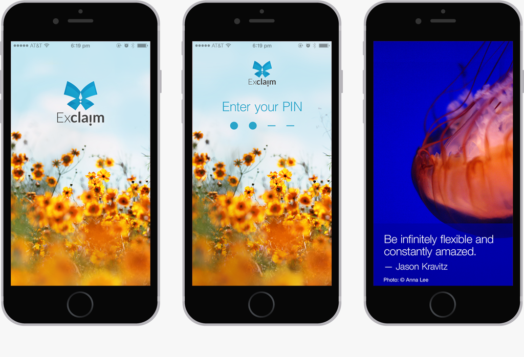
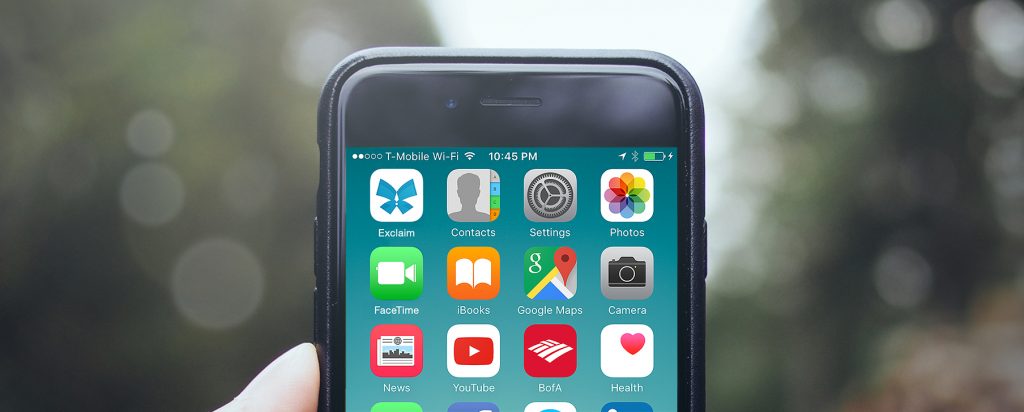
In the logo design process I sketched out a variety of approaches that carried through on that promise, taking into account the fact that the icon needed to stand out on a busy iPhone home screen. The final logo concept stemmed from some early sketches of an “explosion” of claims paperwork and evolved into a graceful butterfly with an exclamation point as it’s body. After considering different color palettes, we settled on a crisp white and calming blue to contrast against the variety of colors on many of our users’ iPhone screens.
Beyond the Logo
The branding process didn’t end with the design of the icon, however. The team and I felt strongly that positivity, relief and confidence should permeate the entire experience of the app. Those keywords guided every aspect of the app’s marketing and UX, including the design of the splash and loading screens, the app’s color palette, and notification wordings.