Project Description
Exclaim iOS App
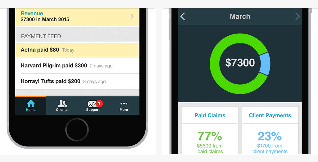
Exclaim is an iOS app that files health insurance claims, keeps track of payments and handles eligibility checks and problem resolutions, all so that psychologists and other mental health practitioners can stop worrying about insurance and focus on treating their patients instead.
I joined Electronic Remedy — a small team of developers and healthcare billing experts — in the early stages of development, and led the UX and UI design.
Skills:
Analysis
Interaction Design
Prototyping
UI/UX Design
User Testing
Visual Design
Wireframing
Peace of mind
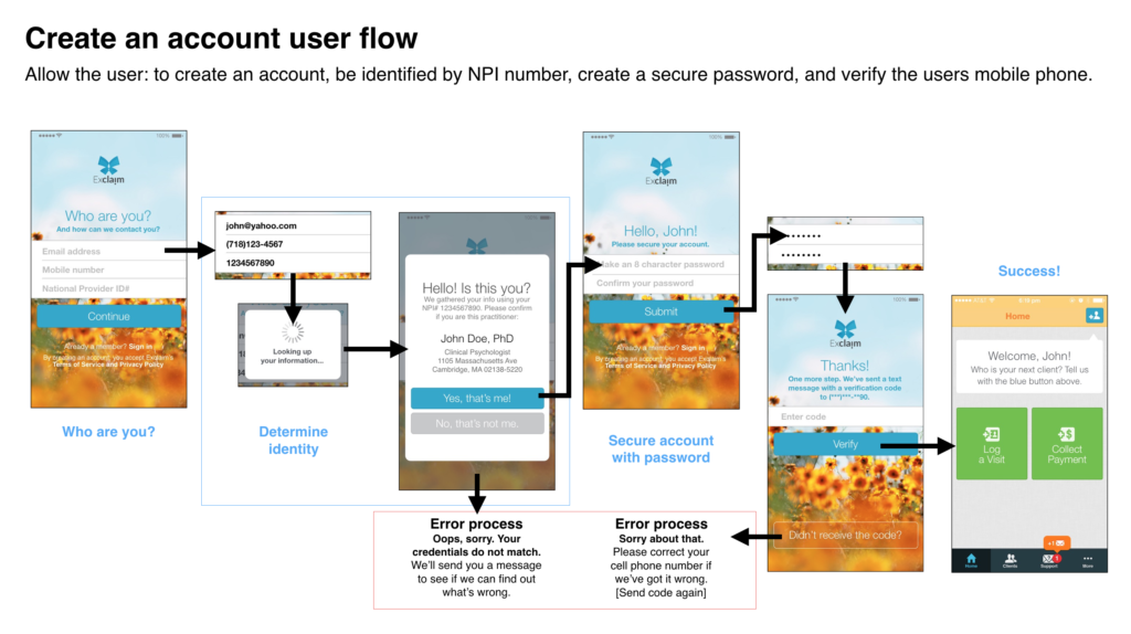
With an eye towards making the process of insurance claim submission simple and worry-free, I sketched detailed wireframes and prototyped the flows for several key user journeys that we identified at the outset: sign up, log in, add client, file claim and collect payment, among others. At every step, we balanced our concerns for ease of use with the stringent requirements of complying with HIPAA laws (making sure the app was automatically logged out when not in use, while ensuring that it was easy to quickly log back in; allowing providers to scan insurance cards, but not saving the photos to the Camera Roll; among many other key features).
Showing only what’s needed
The findings from our branding discussions had helped us realize that we needed to keep hidden the complex engines — intelligent claims filing, automatic problem-resolutions, consistent payment processing — that powered the app, addressing the user only with a swift, calm and confident interface that asked for information only when absolutely necessary, and defaulted to known information whenever possible.
Design as empathy
Ever careful to avoid a “build it and they will come” mentality that prioritizes fancy features and marketing goals over a deep empathy with our user’s very real day-to-day needs, we realized that we needed to develop a simple frictionless flow that seamlessly habitualized claim filing. The app’s flow is designed to eliminate and not replicate our intended users’ current mountain of billing paperwork at the end of every week.
In fact, the whole process of understanding our users began during the branding process, which you can read about here.
